01 — Brand
Who we are, on a page.
AI Qadam isn't a brand bolted on top of a project — it's the visible edge of a community of practitioners building AI in Central Asia. Everything in this system serves that. Qadam means a step forward in the Turkic languages; the mark is one.
Identity
The AI community infrastructure for Central Asia.
Let's make a Qadam toward trust.
#AIQadam
Logo


Theme-adaptive SVG — heads up.
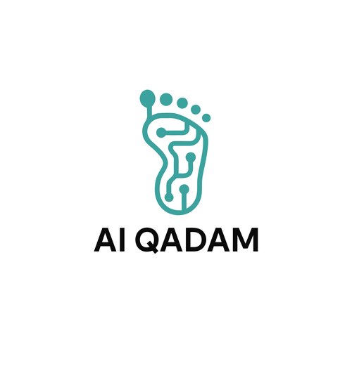
The full lockup carries a theme switch inside the file: letters render dark on light surfaces, off-white on dark; the footprint stays teal. The download is the same file in both themes — what you see depends on where you open it (browser, Figma, Preview each render the fallback differently). For print, partner decks, or any context that needs a fixed colour, open the SVG in Figma or Illustrator and bake the .aiq-logo-dark fill to the colour you need before exporting.
Don't recolour. The mark is the brand teal — anything else reads as a different organisation.
Don't stretch, skew, or rotate. Use the SVG; it scales without loss.
Don't add shadows, glows, gradients, or outlines. The mark is flat.
Don't crop the four dots. They're part of the silhouette, not decoration.
Don't substitute the wordmark with a different typeface — it is the SVG, not Geist.
Don't place the mark on busy imagery. Let it sit on a flat surface with breathing room.
Brand colour
Voice & principles
01
Honesty over hype
No promoting what doesn't exist or lacks real expert backing. Honesty over loud promises.
02
Practice over theory
Speakers share what they did themselves. A real case beats a polished framework.
03
Quality over reach
We measure usefulness, not turnout. 80 engaged people matter more than 500 indifferent ones.
04
The right to fail
We talk about failures openly. An honest post-mortem teaches more than a success story.
05
Community, not channel
Partners invest in people and the community. We're not an advertising venue.
06
Multilingual by default
We speak the languages of the region — state languages, Russian, English — and respect each member's choice.
07
People first
The community exists for the benefit of its participants, not for monetising them through outside interests.
Writing the name
In prose
AI Qadam
Title case. Two words. The Q in Qadam is hard, like in Qazaq.
In the lockup
AI QADAM
All caps, locked together with the mark. Only inside the logo — never in body copy.
Hashtag
#AIQadam
One token, camel case. Used on every public post.
Don't
AI-Qadam · AIQadam · ai qadam · AI Kadam
Hyphens, mashed-up casing, lowercase and phonetic spellings are all out.
02 — Colour palette
Colour, by surface and role.
Brand teal is the only colour with brand meaning. Everything else is a neutral scale plus four semantic accents (success, warning, destructive, live). Tokens are normative — don't invent new ones.
Color tokens
Surface
Brand & semantic
Badge tiers & streak
03 — Typography
Three families, one voice.
Geist for display (titles, hero, brand). Inter for everything you read in a paragraph. JetBrains Mono for technical detail (times, IDs, tags). Both Cyrillic and Latin must read equally well — Central Asia uses both.
Type scale
04 — Photography
Real rooms, real people.
Photography for AI Qadam is documentary, not staged. Real speakers mid-sentence, real laptops, real Q&A hands going up. Avoid stock-AI tropes (blue circuit brains, white robots, glowing data orbs). The honesty principle applies to images too.
No AI-generated humans, robots, brain graphics, or glowing-data backgrounds.
No corporate handshake shots, staged smiles, or empty boardroom posing.
No heavy filters, vignettes, or duotone overlays — keep the colour honest.
No watermarks. Photographer credit goes in caption, not on the image.
Coming soon — curated photo bank for chapter leads & partners.
After Meetup #2 (June 20, 2026) we'll publish the first batch. Until then, ask the country lead for raw assets.
05 — Iconography
Lucide line · brand teal for accents.
Product UI uses Lucide at 2px stroke, 24×24 viewBox. For brand surfaces (decks, merch, posters) the footprint-with-dots motif from the logo is the only allowed pictogram — never duplicate it; never substitute it.
Don't fill brand-mark dots into other icons. The four-dot motif lives in the logo only.
Don't mix icon families. Lucide everywhere; never Heroicons + Phosphor + Lucide in one surface.
Don't recolour icons. Inherit currentColor from text.
06 — Merch templates
Wearables, swag, print.
What AI Qadam chapters hand out at events: a shopper, a notebook, a pen. Funded by partners as a community contribution, distributed free at meetups — never sold.
Want your own AI Qadam merch — for your chapter, your study group, a personal tote? Go ahead. We don't restrict the format; we only ask that the identity travels intact. Non-commercial use only — selling anything that carries the mark, the wordmark, or the brand teal isn't allowed, by anyone. See the Brand Usage Policy.
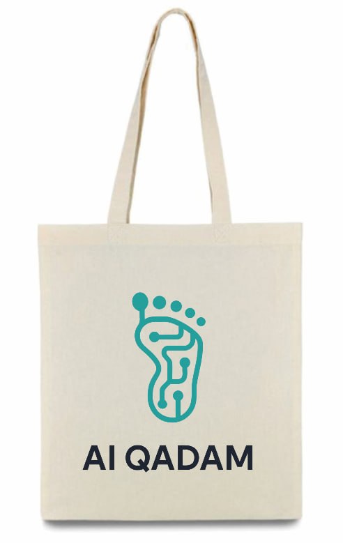 Template
Shopper
Natural cream-canvas tote with long shoulder straps. Full lockup printed on one face — footprint mark in teal, wordmark in dark below. The opposite face stays bare.
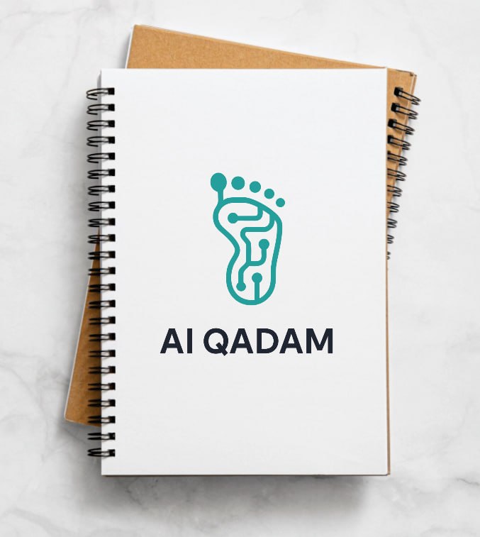 Template
Notebook
Spiral-bound soft-cover notebook in white or kraft. Full lockup centred on the front cover — mark in teal, wordmark in dark below. Twin-loop wire binding on the left, folds flat for note-taking.
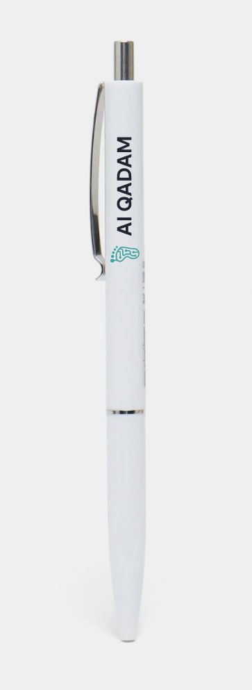 Template
Pen
Matte-white click barrel with a chrome push-button, clip, and a slim accent ring at the centre. Wordmark printed vertically along the upper barrel in dark; the footprint mark sits below in brand teal. No taglines, no slogans.
Making your own?
Use the SVG straight from brand/logo-full.svg or brand/logo-mark.svg — no redrawing, no recolouring, no AI-generated variants. Brand teal prints as Pantone 7716 C for safe colour-matching across suppliers. Paying a vendor to produce a one-off is fine; selling the result isn't — the bag is free, the brand isn't for sale.
07 — Decks & speaker templates
Speakers, fork this.
Two starting points for anyone speaking at an AI Qadam meetup: a PPTX you can open in PowerPoint / Keynote / Google Slides, and an HTML deck that's editable in any text editor — and AI-friendly so you can ask Claude/ChatGPT to draft your slides directly into it.
Both share the same six-slide skeleton: title · speaker bio · section divider · content · quote · closing. Brand visual language (teal, four-dot motif, wordmark) is baked in. Don't override.
Speaker deck · PPTX
16:9, six skeleton slides, brand teal + Inter throughout. Open in PowerPoint, Keynote, or Google Slides; fill in the placeholders.
brand/decks/aiqadam-speaker-template.pptx
Download PPTX
Speaker deck · HTML
Same skeleton, served live in the browser. Edit any <section data-kind="..."> block to author a slide. Keyboard nav (← → space) and a print mode for PDF export. AI-friendly: each slide is a self-contained semantic block.
Don't recolour the wordmark or the four dots. Teal lives on --primary; everything else is neutral.
Don't use AI-generated imagery. Photos must be real — see Photography.
Don't substitute the display family. Geist for headings, Inter for body, JetBrains Mono for meta.
Don't bury the speaker. Name + role on slide 2 is non-negotiable.
Don't pitch a product on a community meetup deck. See Brand Usage Policy — partners contribute, they don't advertise.
Don't drift the eyebrow. Always AI Qadam · <context> in JetBrains Mono caps.
08 — Event stands
Backwalls, counters, screens.
What a chapter puts on a conference booth. Venues hand you different furniture every time, so this section is deliberately about placement rules and artwork templates, not about one particular stand — the panel behind you and the counter in front of you do different jobs, and getting that wrong is what makes a booth invisible.
The one rule that decides everything else: a booth has exactly one call to action. Two QR codes on two surfaces means people stop to choose instead of scanning. Put the code where it can actually be reached, and let the other surface carry the identity.
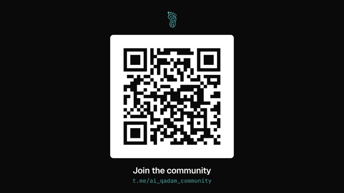 Template
Screen
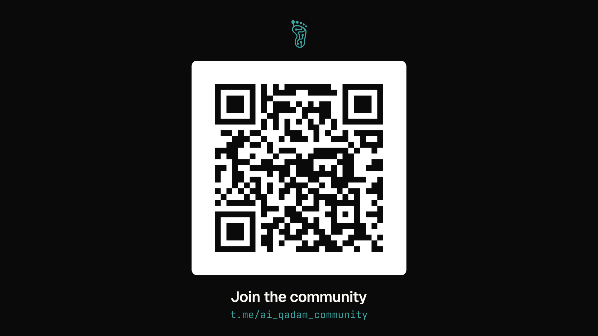
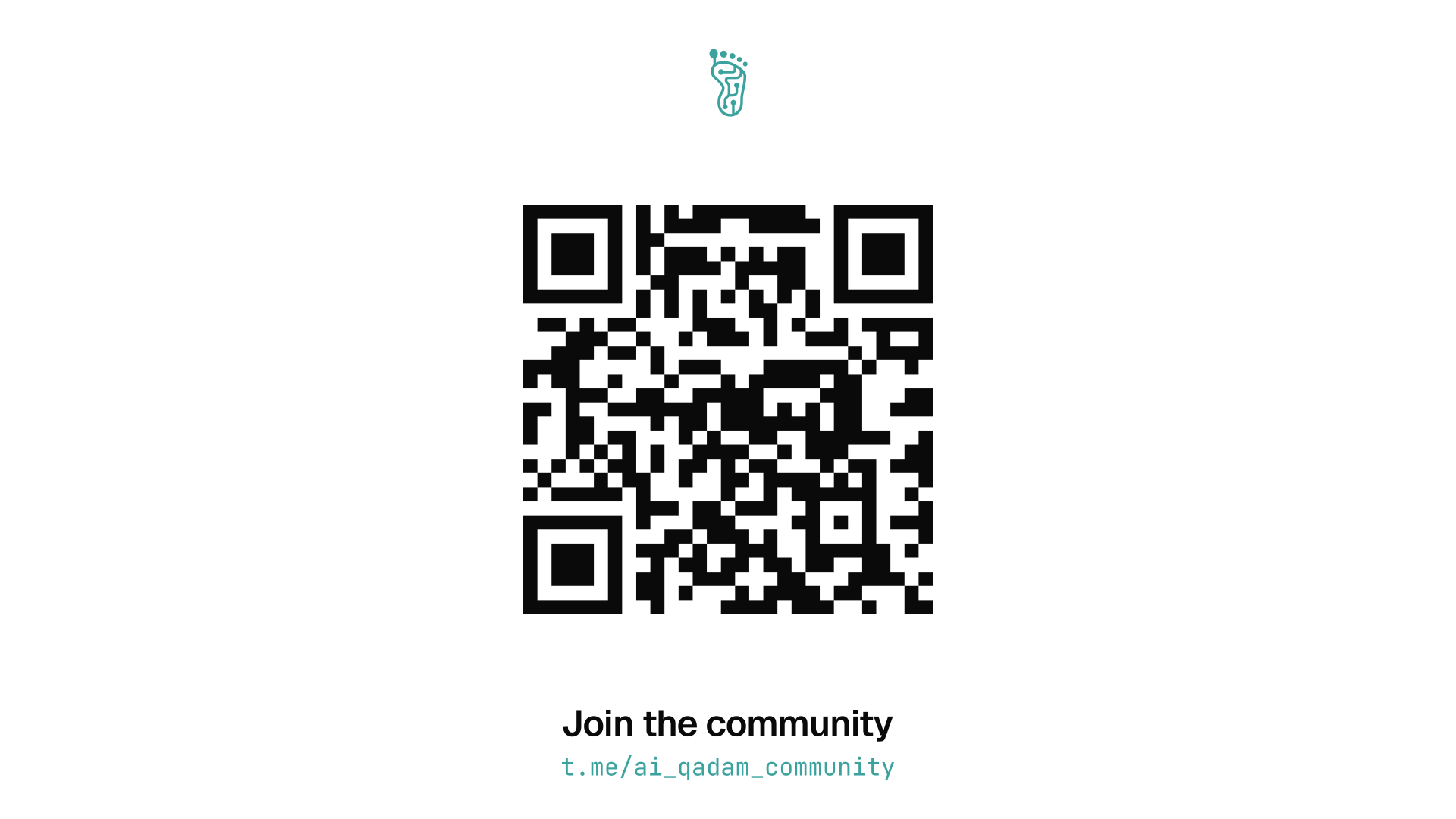
The screen carries the action. QR centred and dominant, the mark small above it, one line of address below — nothing else competes. Sits at roughly eye level on the panel, which is the only place on a booth that reliably falls inside the scanning zone. Dark version is the default; the light one is for brightly-lit halls.
 Template
Counter panel
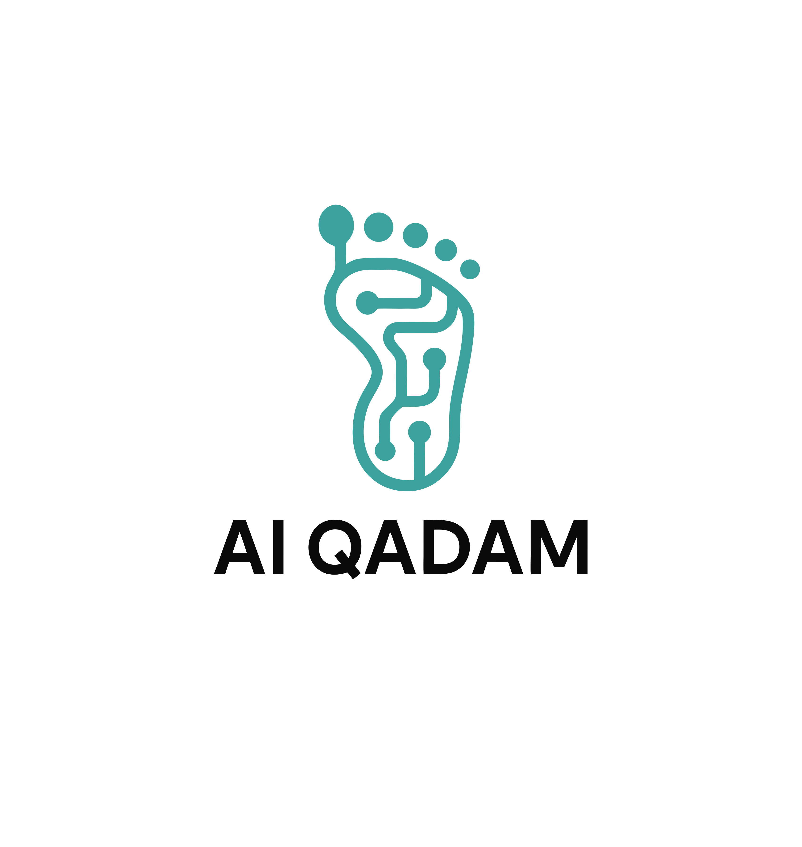
The counter carries the identity, and only that: the full lockup centred, roughly 47 % of the panel width, on white. No QR, no tagline, no strapline. Centre it optically, a little above the geometric middle — a lockup has a word underneath and air above, so maths-centred always reads low.
Everything on a booth lives or dies by how high it sits. The numbers below are the transferable part — the furniture in the drawing is one venue's, yours will differ.
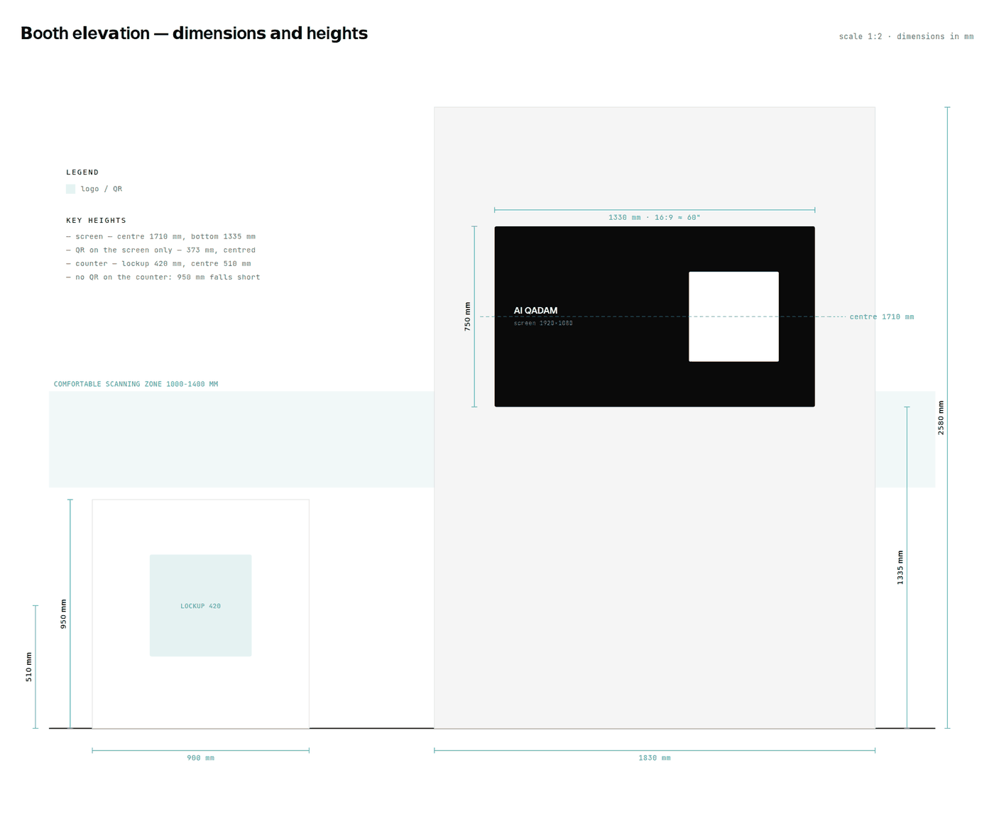
1000–1400 mm is the scanning zone. Below a metre people have to crouch; above 1.4 m they have to reach over the counter. Anything you want scanned belongs in that band.
A standard counter cannot reach it. Counters run about 950 mm tall, so the top of the front panel stops below the band. That is the reason the QR goes on the screen and the counter gets the lockup — not an aesthetic preference.
Screen centre around 1700 mm. For a 55–65″ display that puts the middle of the picture at standing eye level and the QR comfortably inside the band.
A printed QR that does not scan is a reprinted panel. Four rules cover nearly every failure we have seen.
Quiet zone: four modules, always. The empty margin around the code is part of the code. It is the first thing layouts eat and the most common reason a print fails to scan.
Size ≈ scanning distance ÷ 10. Read from 4 m, print at 400 mm. Then check it with a phone from that distance — not from arm's length in front of a monitor.
Error correction Q. On the payloads we use it costs nothing over level M — the symbol stays 29×29 — and buys 25 % redundancy against a scratch, a glare spot, or a thumb.
Dark code on light ground. Never teal. The brand teal on white is about 3:1 — some phone cameras simply will not read it. #0A0A0A on white is about 20:1. Teal belongs on the frame around the code, never on the modules.
Running your own booth?
Take the templates and re-scale them to whatever the venue gives you — keep the lockup at roughly half the panel width, keep the QR inside the scanning band, keep one call to action. Generate your own QR: the code in these files points at the AI Qadam community chat, which is almost certainly not where you want your visitors to land. Logo straight from brand/logo-full.svg — no redrawing, no recolouring. Brand teal prints as Pantone 7716 C.